
Last modified: 2025-05-24 by bruce berry
Keywords: cape town |
Links: FOTW homepage |
search |
disclaimer and copyright |
write us |
mirrors
 image by Martin Grieve, 27 Nov 2016
The first formal settlement in South Africa was established when Jan van
Riebeeck landed at the Cape of Good Hope in 1652 and set up a refreshment
station for ships of the Dutch East India Company sailing between Europe and the
Indies. This was the origin of the city, the current legislative capital of
South Africa and provincial capital of the Western Cape.
Prior to the adoption of the recent logo-type symbols for Cape Town, the flags
of the City were more heraldic in nature being derived from the oldest civic
coat of arms in South Africa which were granted to the "Community of Cape Town"
by the Commissioner General of the Batavian Republic, AJ de Mist, in the form of
a seal, on 12 June 1804. This seal comprised the shield of arms of Jan van
Riebeeck, namely: Gules, three annulets Or, surmounting a black anchor with a
riband through the ring, within the circumscription "ZEGEL VAN DE KAAPSTAD".
ct-seal.jpg) scan
by Bruce Berry, 03 July 2006
scan
by Bruce Berry, 03 July 2006
After nearly 150 years in Dutch hands, the Cape was then occupied by British
forces in 1795 during the Napoleonic Wars but was handed back to the Batavian
Republic, as the Netherlands was then known, in 1803. It was re-occupied by
British forces in 1806 and in terms of the Articles of Capitulation dated 10
January 1806, it was stated that the burghers and inhabitants retained all
rights and privileges they had hitherto enjoyed. The seal of Cape Town granted
in 1804, and also the arms which were an integral part of the seal, thus
remained in use. It was only at the end of the 19th century that a Patent of
Arms was requested from the College of Arms in London. This Patent, dated 29
December 1899, confirmed the essence of the grant by de Mist, but augmented the
arms with the addition of a helmet, crest, mantling, supporters and a motto.
ct.gif) scan by
Bruce Berry, 03 July 2006
scan by
Bruce Berry, 03 July 2006
These arms were later registered, unchanged, by the South African Bureau of
Heraldry on 06 January 1972.
Bruce Berry, 03 July 2006
 image by Martin Grieve, 04 July 2006
While initially following the adoption of the new municipal logo, the
new municipal flag simply featured the new logo on a white background between
2003 and 2004,
subsequently flags have been made featuring the logo with the name of
the city and its slogan on a white field with a yellow border.
Bruce Berry, 04 July 2006
 image
by Martin Grieve, 04 July 2006
image
by Martin Grieve, 04 July 2006
The new City of Cape Town Metropolitan Council, one of six metropolitan councils
formed following the re-organisation of South African local authorities in
December 2000, is an amalgamation of the former municipalities of Blaauwberg,
Cape Town, Tygerberg, Helderberg, Oostenberg, and
South Peninsula (Fish Hoek,
Simsonstown and Muizenberg).
On 27 August 2003 a new logo design was chosen to form the basis of the visual
identity for the Cape Town metropolitan council. The logo bears a brush stroke
outline of Table Mountain against a backdrop of South African flag-coloured
brush strokes with the name of the City in the most prominent languages used in
the area, namely English, isiXhosa and Afrikaans, underneath. This logo, again,
formed the basis for another new flag used by the City of Cape Town.
The symbolism of the new logo is directly related to the notion of the South
African "rainbow nation" and its connotations with diversity and unity. This
symbolism is carried forward in a more recent refinement in the design of the
municipal logo. Though the logo is not an image of a real rainbow, it again
draws its colours from the national flag and this in turn demonstrates Cape
Town's linkages and role within the greater South African context. Table
Mountain is the central symbol that is
accepted as representing the City both within South Africa and overseas.
Bruce Berry, 04 July 2006
![[Cape Town flag]](../images/z/za-ctown.gif) image
by Jorge Candeias, 11 Apr 2001
image
by Jorge Candeias, 11 Apr 2001
Cape Town was the first local municipality in the transitional period (between
April 1994 and December 2000) to replace its formal coat of arms in use since
1899 with a logo. This logo was designed by a graphic artist and was chosen in
July 1997 from 140 entries received in a competition and formed the basis of a
new municipal flag. This flag had a stylised image of Table Mountain, the most
well known landmark in the city, in white on a mainly blue field extending from
the hoist, a green rectangle against the fly, and a red base throughout. Below
the Table Mountain image is a yellow "brush stroke" horizontal stripe which
separates the red base from the blue and green.
The white outline of the mountain hinted at the famous cloud "table-cloth" which
sometimes covers Table Mountain, the blue band stood for the unpolluted sky and
oceans and the green for the lush, natural environment of Cape Town. The
vibrant city lying in the shadow of Table Mountain was symbolised by the red
band and the yellow dash was characteristic of the cosmopolitan nature of the
inhabitants of the city. It was said that the bright colours and more informal
feel epitomised the progressive nature of the city and its people.
Bruce Berry, 04 July 2006
You have a flag of that ghastly squiggle logo that represents Table
Mountain. I saw two examples of different squiggles (both representing
the mountain) when I was down in Cape Town about 2 years ago. I saw neither
on a flag - both were on boards. One of the two logos was for the Greater
Cape Metropolitan Council (covering the entire Cape Peninsula except
for the nature reserve at the southern tip, the Cape Flats, Somerset West,
Strand, Gordon's Bay, the Tygerberg area and the areas on the north shore
of Table Bay) and the other for the Cape Town Municipality (a sub-metropolitan
regional council covering the so-called City Bowl, the southern suburbs
near the mountain down as far as Wynberg, and the Atlantic seaboard, I
think including Hout Bay).
I can't recall which logo was which - the drawbacks of trendy design!
But my reason for writing is that in the 1960s, 1970s and 1980s there
was a navy blue or royal blue flag bearing the arms of Cape Town: a gold
shield bearing an anchor, with a red inescutcheon bearing three annulets.
I couldn't quote you the dimensions off-hand, but it was regularly flown
at municipal congresses. The Coat of Arms can be found on this
site.
Mike Oettle, 18 Dec 2001
The City of Cape Town has also adopted a new flag to replace that based on
the municipal Arms. The new flag has a stylised image of Table Mountain in white
on a background of blue in the top left half and green on the top right
hand corners. Below the Table Mountain image is a yellow "paint brush"
horizontal stripe under which is a red stripe at the bottom of the flag.
Like the flag of the Cape Metropolitan Council, the flag was designed by
a graphic artist. Uniquely in Southern Africa, the flag is
the now main symbol used by the municipality since no new arms for the
city have yet been adopted. Like the flag of the Cape Town Metropolitan Council, this flag has also not been registered with the
Bureau of Heraldry.
Bruce Berry, 20 Dec 2001
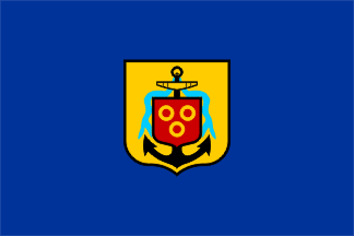 image by Martin Grieve, 08 Apr 2005
The former flag of the City of Cape Town
had a blue field in the centre of which was the municipal arms, described by Dr
Cor Pama, as comprising a "blue field with the old arms, as granted by de Mist,
in the middle". No specific date of adoption is provided.
The shield of the municipal arms was originally granted as part of
a seal by the then Commissioner-General in June 1804 under authority from
the Batavian Government. It was only in February 1899 that the full
arms were granted under Letters Patent from the College of Arms in London
following the addition of a crest, mantling and supporters. These
were registered, unchanged, by the South African Bureau of Heraldry on 16 January 1972
and are described as follows:
ARMS: Or, an anchor erect Sable, stock proper, from the ring a riband
flowing Azure and suspended therefrom am escutcheon Gules charged with
three annulets Or
CREST: On the battlements of a tower proper, a trident in bend Or,
surmounted by an anchor and cable in bend sinister, Sable
WREATH AND MANTLING: Or and Sable
SUPPORTERS: On a compartment below the shield consisting of rocky mounds,
dexter, a female figure proper vested Argent, mantle and sandals Azure,
on her head an estoile irradiated Or, supporting with her dexter hand an
anchor proper; sinister, a lion rampant guardant Gules
MOTTO: SPES BONA (Good Hope).
It was some years after the granting of the arms by the College of Arms
that the City Council also adopted a municipal flag that had a blue field
with the original arms (seal), as granted by Commissioner-General De Mist,
in the centre. (There is an illustration of this flag in Lions and Virgins
by Dr. C Pama). This flag was used until a new flag was adopted by
the new Cape Town Metropolitan Council following the re-organisation of
local government in South Africa in 1997. With the introduction of
the new flag, Cape Town is unique in South Africa in that no new arms have
yet been adopted although those described above are no longer used.
Bruce Berry, 20 Dec 2001
Another civic flag was in use on the Cape Peninsula between 1995 and December
2000 when the municipalities of the City of Cape Town, Blaauwberg, Helderberg,
Oostenberg, South Peninsula and Tygerberg formed the Cape Metropolitan Council
during the transitional period (not to be confused with the post-2000 Cape Town
Metropolitan Municipality).
The Cape Metropolitan Council adopted a logo in August 1996 to promote a fresh
identity for the organisation. The design of the logo was chosen after 48
designers were invited to submit designs. The winning design was selected from a
short-list of 12 and took the form of a stylised Table Mountain with an outline
of the coastline of the Peninsula and Cape Metro area below. The colours of the
emblem blend from dark green, light green, white through to almost purple and to
green again. Six purple horizontal lines bisect the lower half of the emblem
representing the six municipalities that formed the metro.
 image by Martin Grieve, 04 July 2006
This logo also formed the basis of a flag for the Cape Metro Council. For ease
of manufacture, the colours of the logo on the flag were simplified to grey,
dark blue, green and white and the name of the Council was omitted.
The head office of the Cape Metropolitan Council was in Cape Town which is
symbolised by Table Mountain. Its area of jurisdiction was shown by the stylised
coastline of the Cape Peninsula and the curved shape symbolises the
encapsulation of the new metropolitan area. The light reflecting in the water
was to show the confidence in the future of the Cape.
This flag and logo also ceased to be used after 05 December 2000 following the
establishment of the City of Cape Town in terms of the new local government
legislation.
Bruce Berry, 06 July 2006
![[Old Cape Town banner]](../images/z/za_ctold.jpg) image sent by Mike Oettle, 07 Oct 2002
image sent by Mike Oettle, 07 Oct 2002
Going through some old papers I came across a clipping from the front page of The Argus newspaper in Cape Town, dated 24 April 1975. The attached image reduces the colour photograph to something like a 17th-century Dutch painting, I think, but the essential flag elements ñ the main banner and the trumpet and drum banners ñ can be made out clearly. (Were drum banners used in former times? It seems out of place.)
The caption reads:
WITH THE AUTUMNAL SUN glinting on the City Hall portals, four men in
colourful period costume set off on a march through the city's streets carrying the Cape Town Festival armorial
bearings. This daily Festival ritual starts at 9 am. Helmut Otto (standard bearer), Peter Hamblin (drummer), Rainie
Strydom (trumpeter on left) and Graham Coote (trumpeter) descend the City Hall steps.
The banner was specially devised for the festival of that year and was
also hung from street poles. It takes the lion supporter from the city arms and makes it a banner bearer within the banner;
the small banner being the contents of the shield in the arms granted to the city in 1899 by the College of Arms. (See
http://uk.geocities.com/armoria/muni/CapeTown.html).
I don't yet have an image of the flag used by Cape Town in that period,
but it was principally blue, and if I recall correctly it had a shield of the arms offset to the hoist. The blue in the city flag
was darker than the blue this banner, though.
The lion's tongue is a much paler blue, and the claws, which in the
armorial achievement should also be blue, are shown as white, no doubt because of the blue background behind the red lion,
a clear breach of the colour rule. The edging is in black and yellow ñ the black taken from the colour
of the anchor. The anchor was the common feature (as a single supporter) in the civic arms granted in 1804 by Commissioner-General
Jacob Abraham Uitenhage de Mist (see http://uk.geocities.com/armoria/DCs/dist_auth.html#anchor).
Mike Oettle, 07 Oct 2002


 Premium")

")