
This page is part of an mirror of © FOTW Flags Of The World website
This website is devoted to the science of vexillology (the study of flags).
All illustrations presented on this website serve exclusively to provide information in the context of vexillology.
The authors and hosts of this site explicitly distance themselfes from any symbols of unconstitutional organizations that may be depicted here.
Last modified: 2021-08-25 by rob raeside
Keywords: trinidad | trinidad and tobago | point fortin |
Links: FOTW homepage |
search |
disclaimer and copyright |
write us |
mirrors
 image by Olivier Touzeau, 12 September 2017
See also:
The flag in use photographed in 2017 in the Local Government orientation
seminar organized by the Ministry of Rural development and Local government has
a colourful logotype in the central white stripe.
See: Trinidad and Tobago - Subdivisions - Sources
Olivier Touzeau, 12 September 2017
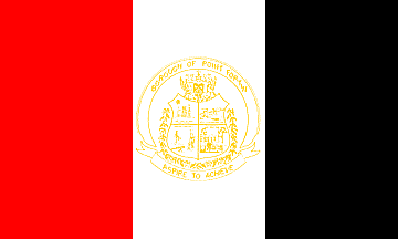 (3:5)
image by António Martins-Tuválkin, 20 July 2007
(3:5)
image by António Martins-Tuválkin, 20 July 2007
based on text at www.pointfortin.com
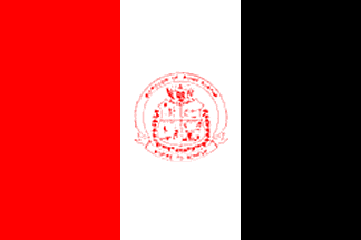 (1:2) image by António Martins-Tuválkin, 20 July
2007
(1:2) image by António Martins-Tuválkin, 20 July
2007
incorrect design based on image at
www.pointfortin.com
From www.pointfortin.com:
"The Borough Flag The Colours of the Borough Flag are Red,
White, Black and Yellow Gold. The Colours of the Flag were taken
out of the National Flag since the Borough of Point Fortin is the
First Republic Borough in the history of Trinidad and Tobago. The
dimension of the Flag shall be in the proportions of (5:3). The
Flag will be divided into 1/3 Red, 1/3 White and 1/3 Black, bands
on the vertical. On the centre White Bank is superimposed the
Yellow gold Emblem or Seal of the Borough. The Red Band must
always be nearest to the pole or Flag Staff.
The Meaning of the Flag - The Red represents the Energy of the
People and the Industries of the Borough. The White represents
the "Purity" of the Borough since the nation achieved
Republican status. The Black represents the Oil, the indigenous
wealth of the Borough and its potential. The gold
represents the enriched talent of our Burgesses."
Valentin Poposki, 1 April 2006
The text we have states that the flag should have 3:5
proportions (although the image shown at it is 2:3) but clearly a
horizontally elongated shape is meant. Attentive reading shows
also that the emblem is to be rendered in golden shades on white,
unlike the said original image, in red.
It should be noted that the seal on the flag uses a shield on its
center, unlike what seems to be the borough logo, as shown the
official site at < www.pointfortin.com>,
which places a different design (featuring, again, the colors
red, white and black) on the seal’s rim and scroll.
António Martins-Tuválkin, 20 July 2007
Advertisement from our sponsor:
Bei Fahnenversand.de erhalten Sie eine Vielzahl an hochwertigen Flaggen, Pins und Aufnähern, zum Beispiel:


