This page is part of an mirror of © FOTW Flags Of The World website
This website is devoted to the science of vexillology (the study of flags).
All illustrations presented on this website serve exclusively to provide information in the context of vexillology.
The authors and hosts of this site explicitly distance themselfes from any symbols of unconstitutional organizations that may be depicted here.
Last modified: 2026-09-26 by  zachary harden
Keywords: toyama | imizu |
Links: FOTW homepage |
search |
disclaimer and copyright |
write us |
mirrors

image by Tomislav Šipek, 04 June 2014
The flag of the city of Imizu is white with mark.
Source:
http://www.city.imizu.toyama.jp/guide/svGuideDtl.aspx?servno=5123
Tomislav Šipek, 04 June 2014
The city emblem was adopted on Nov 1st 2005 by Notice No1 but there is no
flag law. The white flag has a blue city emblem in the center. The city emblem
is a stylized hiragana い I of Imizu in a form of aglitter Japan Sea and a
waterdrop. It represents a sustainable development.
Nozomi Kariyasu, 05 June 2014
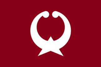
image by Tomislav Šipek, 06 June 2014
The flag of the former town of Daimon was maroon with mark. The town is now,
from 2005, part of the city of Imizu.
Sources:
http://www.kitanippon.co.jp/pub/hensyu/gappei/jichi/052.html
http://warp.da.ndl.go.jp/info:ndljp/pid/241484/www.town.oshima.toyama.jp/115/1154.html
http://web.archive.org/web/20050315120248/http://www.town.kosugi.toyama.jp/prm/h16/200412/h06-07.pdf
Tomislav Šipek, 06 June 2014
The kanji character “大” (great) has been stylized, and the circular shape symbolizes the town's harmony.
Nozomi Kariyasu, 02 September 2026
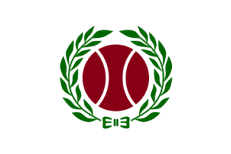
image by Tomislav Šipek, 06 June 2014
The flag of the former town of Kosugi was white with mark. The town is now,
from 2005, part of the city of Imizu.
Sources:
http://www.kitanippon.co.jp/pub/hensyu/gappei/jichi/052.html
http://warp.da.ndl.go.jp/info:ndljp/pid/241484/www.town.oshima.toyama.jp/115/1154.html
http://web.archive.org/web/20050315120248/http://www.town.kosugi.toyama.jp/prm/h16/200412/h06-07.pdf
Tomislav Šipek, 06 June 2014
The kanji character “小” (small) is stylized into a maroon circle and surrounded by cedar leaves, symbolizing a town rich in greenery.
Nozomi Kariyasu, 03 September 2026
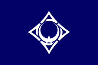
image by Tomislav Šipek, 06 June 2014
The flag of the former town of Oshima was blue with mark. The town is now,
from 2005, part of the city of Imizu.
Sources:
http://www.kitanippon.co.jp/pub/hensyu/gappei/jichi/052.html
http://warp.da.ndl.go.jp/info:ndljp/pid/241484/www.town.oshima.toyama.jp/115/1154.html
http://web.archive.org/web/20050315120248/http://www.town.kosugi.toyama.jp/prm/h16/200412/h06-07.pdf
Tomislav Šipek, 06 June 2014
The kanji character “大” is stylized to resemble a bird with outstretched wings, and is surrounded by four katakana characters “マ.”
Nozomi Kariyasu, 03 September 2026
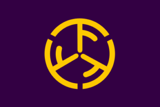
image by Tomislav Šipek, 06 June 2014
The flag of the former village of Shimo was maroon with mark. The village is
now, from 2005, part of the city of Imizu.
Sources:
http://www.kitanippon.co.jp/pub/hensyu/gappei/jichi/052.html
http://warp.da.ndl.go.jp/info:ndljp/pid/241484/www.town.oshima.toyama.jp/115/1154.html
http://web.archive.org/web/20050315120248/http://www.town.kosugi.toyama.jp/prm/h16/200412/h06-07.pdf
Tomislav Šipek, 06 June 2014
It combines three “下” kanji characters to symbolize the village's unity and peace.
Nozomi Kariyasu, 15 September 2026
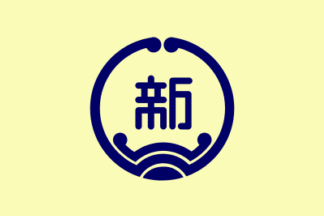
image by Tomislav Šipek, 06 June 2014
The flag of the former city of Shinmisato was yellowish with mark. The city
is now, from 2005, part of the city of Imizu.
Sources:
http://www.kitanippon.co.jp/pub/hensyu/gappei/jichi/052.html
http://warp.da.ndl.go.jp/info:ndljp/pid/241484/www.town.oshima.toyama.jp/115/1154.html
http://web.archive.org/web/20050315120248/http://www.town.kosugi.toyama.jp/prm/h16/200412/h06-07.pdf
Tomislav Šipek, 06 June 2014
The kanji character “新” (shin) in the center symbolizes constant progress, while the circular shape represents harmony among citizens and the city's status as a port city.
Nozomi Kariyasu, 15 September 2026
Advertisement from our sponsor:
Bei Fahnenversand.de erhalten Sie eine Vielzahl an hochwertigen Flaggen, Pins und Aufnähern, zum Beispiel: